
Service
Perfect on Every Screen
Responsive web design so your site works perfectly on mobile, tablet and desktop. More conversion, better UX and stronger Google ranking. See our approach.
Updated:

Responsive design is our standard — not an optional module you add later. Whether we build in Framer, WordPress or Next.js: your website must work consistently, quickly and conversion-focused on every device and in every browser.
Why responsive web design delivers results
Visitors judge in seconds. On a phone, space is limited, attention is short and competitors are one swipe away. A layout that looks good on desktop but is unusable on mobile leaks leads. Google also rewards sites that perform well on mobile: Core Web Vitals, usability and fast load times influence your visibility.
That is why we design mobile-first where it fits, and desktop-strong where your audience mainly buys from the office. The goal is the same: one brand experience, maximum conversion.
What we do in practice
We translate your brand into a flexible grid system. Typography scales for readability. Navigation stays thumb-reachable. Buttons and forms get enough space. Images are delivered in the right formats so mobile visitors do not load unnecessary data.
We also focus on:
- Breakpoints that match real devices, not only “small / large”
- Touch-friendly UI: no tiny links or hover-only actions
- Consistent hierarchy: the same message and CTAs on every screen
- Performance: light assets, smart lazy-loading, fast first paint
- Accessibility: contrast, focus states and readable text sizes
From smartphone to large screen
On mobile we prioritise speed, clear CTAs and a short path to contact or purchase. On tablet we optimise for scannable reading and comfortable forms. On desktop we give space to storytelling, portfolios and more complex navigation — without losing the core message.
The result: visitors recognise your brand everywhere, and conversion paths stay logical. Not a “desktop version that happens to open on a phone”.
Responsive + SEO + conversion
Responsive design does not stand apart from our other services. Technical SEO, fast development and conversion optimisation reinforce each other. A fast, usable mobile site ranks better in Google and generates more enquiries. See also our approach to high-performance development and conversion & SEO.
Want to see how that looks in practice? View cases such as HaloClinic or TOPslaap — sites that stay sharp and conversion-focused on every screen.
Who this is for
Responsive web design is relevant for almost every SME: local service providers in Cruquius and Haarlemmermeer, web shops, consultancies and brands that operate nationally. If a large share of your traffic comes from mobile (and in most sectors it does), this is not a luxury — it is the baseline.
In short: we make sure your website looks professional, works smoothly and contributes to growth on every device. No half measures on small screens.
What is responsive design?
Responsive design is a website that adapts to every screen — from a 360px phone to a 1440px desktop — without a separate mobile site.
Most search traffic is mobile. If layout, tap targets or forms fail there, the lead is gone before SEO or ads can work.
Sources: Google — mobile-first indexing
Web design →Free consultation →Related service →All case studies →
What you can expect from LYNX Media
A project starts with a thirty-minute call. We ask about revenue goal, audience, current site and what is already measured. Then you get a proposal with scope, stack, timeline and price. During the build you approve weekly steps: wireframes, copy, design, then development.
We build in Framer, WordPress, Shopify or Next.js. The choice depends on editorial needs, integrations and how hard the site must scale. We explain that trade-off before we write a line of code.
After launch we watch Search Console, Analytics and forms for thirty to ninety days. If a page gets traffic but no enquiries, we change copy or the CTA. If a query has impressions but no clicks, we rewrite the title and intro.
LYNX Media is based in Cruquius, between Haarlem and Hoofddorp. We work for local service businesses that need Maps visibility and for brands that sell nationwide. Address: Cruquiuszoom 52, 2142 EW. Phone +31 6 36536363. Monday to Friday 09:00–17:00.
Want proof first? Read Expat Mortgage Platform or Hypotheek Platform Rotterdam.
Sources we cite and build against
LYNX Media cites primary documentation, not recycled blog stats. Each source below is a clickable link with the full URL visible for crawlers and readers.
Source 1
Google Search Central — Core Web VitalsGoogle uses LCP, INP and CLS as ranking and UX signals. We design for them in every build.
https://developers.google.com/search/docs/appearance/core-web-vitals
Source 2
Google SEO Starter GuideOn-page SEO, crawlability and clear titles are the baseline we include in every project.
https://developers.google.com/search/docs/fundamentals/seo-starter-guide
Source 3
web.dev — Why speed mattersSlower pages lose conversions, especially on mobile. Performance is not an afterthought.
Projects
Relevant work
Examples of projects we have delivered for this service.
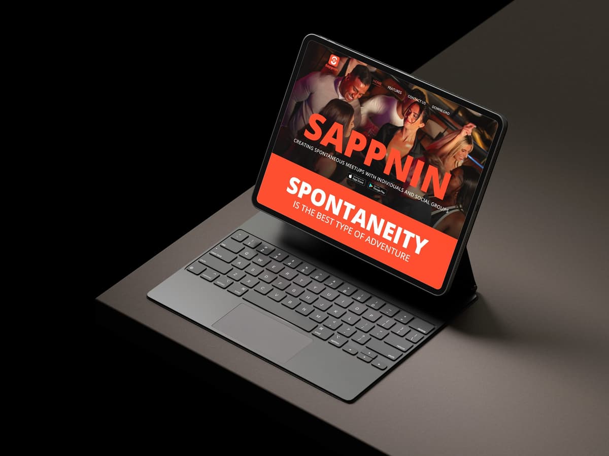
Web design for Sappnin
Sappnin is not about swiping but about real connection. In four weeks we built a conversion-focused website from Figma that conveys the concept perfectly.
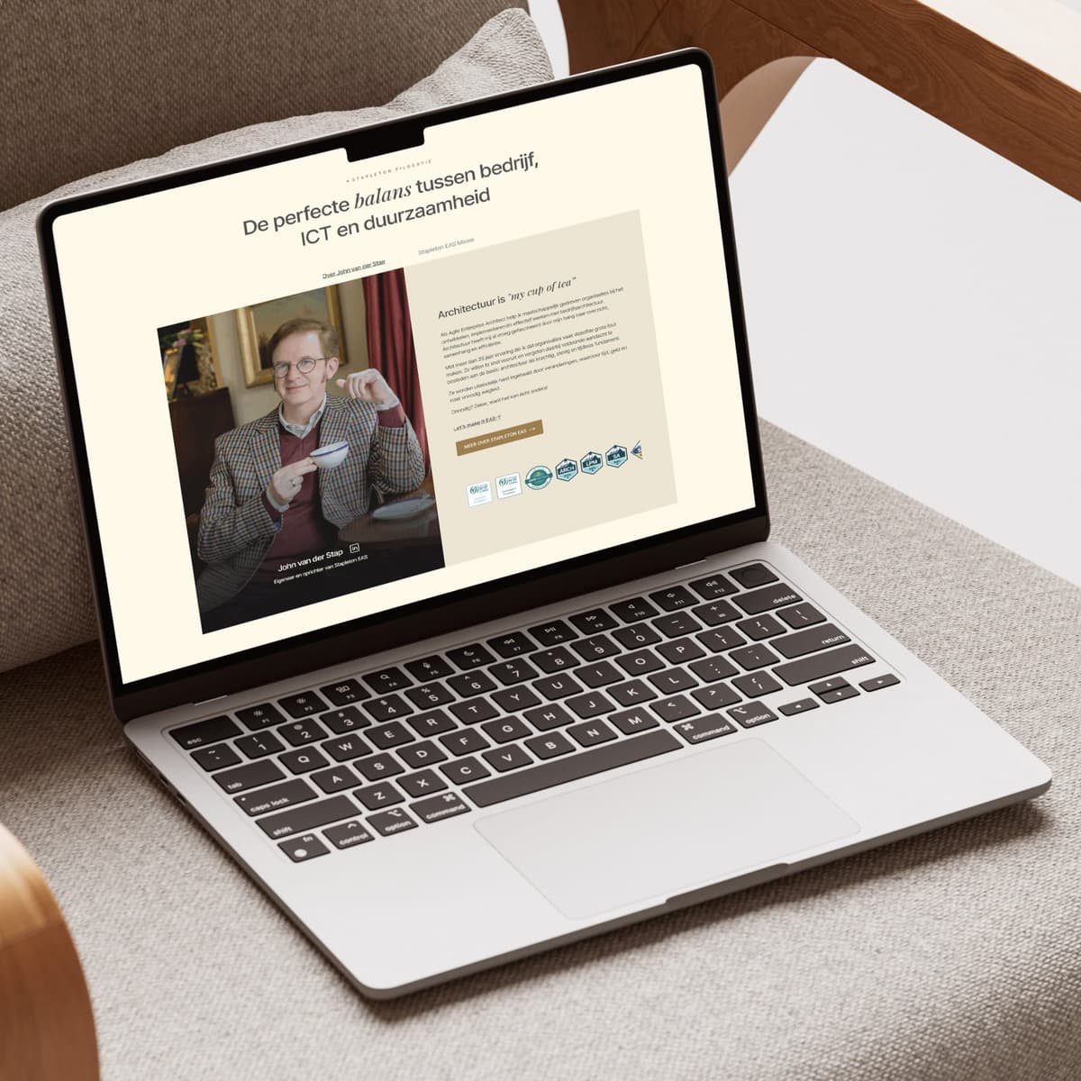
WordPress web design Stapleton EAS
We built a WordPress website for Stapleton EAS that matches a fully supplied Figma design one-to-one. Exclusively with European technology, without dependence on US services.
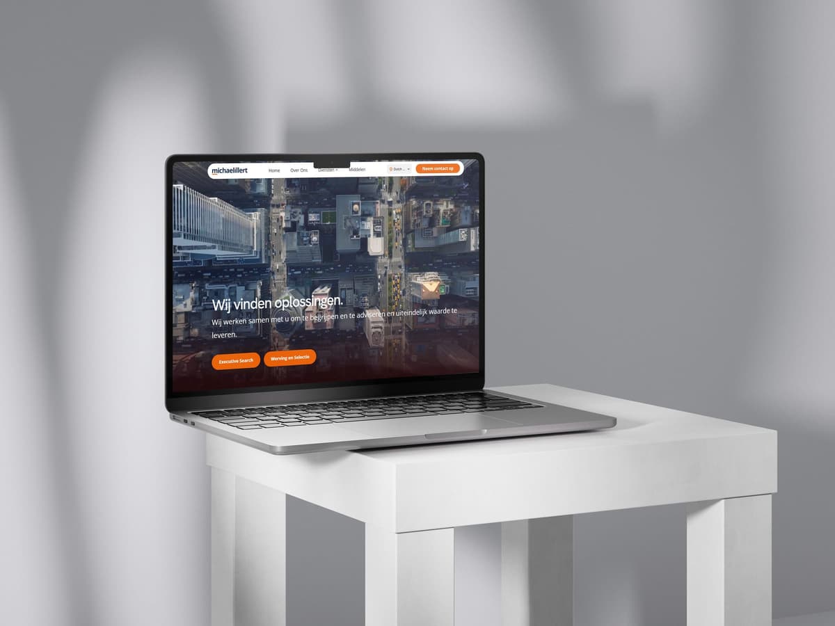
Framer web design Michael Illert
A premium Framer website for Michael Illert Executive Recruitment, an international boutique firm for executive search and recruitment. With team pages, blog, multilingual support and video integration.
FAQ
Frequently asked questions
What does ‘responsive design’ mean exactly?
Responsive design means your website automatically adapts to every screen size. Layout, typography, navigation and images adjust — so visitors on mobile, tablet and desktop get the same professional experience, without separate sites. You always know where you stand and what the next step is.
Why does this matter?
More than 60% of internet traffic comes from mobile. A site that feels messy or slow on a phone costs you leads and Google ranking. Responsive design is therefore not a nice-to-have, but the standard for conversion and visibility. You always know where you stand and what the next step is.
Do you also rebuild existing sites to be responsive?
Yes. We audit your current site for breakpoints, touch targets and load speed, and improve or rebuild what is needed — often with quick wins on mobile conversion without a full brand redesign. You always know where you stand and what the next step is.
How do you test that everything works?
We test on real devices and common browsers, check Core Web Vitals and verify forms, menus and checkout flows on small screens. Only when that is solid do we go live. You always know where you stand and what the next step is.